Earlier this year, Shehar Bano summarised our work on scanning the Internet and categorising IP addresses based on how “alive” they appear to be when probed through different protocols. Today it was announced that the resulting paper won the Applied Networking Research Prize, awarded by the Internet Research Task Force “to recognize the best new ideas in networking and bring them to the IETF and IRTF”. This occasion seems like a good opportunity to recall what more can be learned from the dataset we collected, but which couldn’t be included in the paper itself. Specifically, I will look at the multi-dimensional aspects to “liveness” and how this can be represented through holographic visualisation.
One of the most interesting uses of these experimental results was the study of correlations between responses to different combinations of network protocols. This application was only possible because the paper was the first to simultaneously scan multiple protocols and so give us confidence that the characteristics measured are properties of the hosts and the networks they are on, and not artefacts resulting from network disruption or changes in IP address allocation over time. These correlations are important because the combination of protocols responded to gives us richer information about the host itself when compared to the result of a scan of any one protocol. The results also let us infer what would likely be the result of a scan of one protocol, given the result of a scan of different ones.
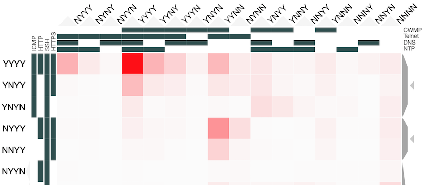
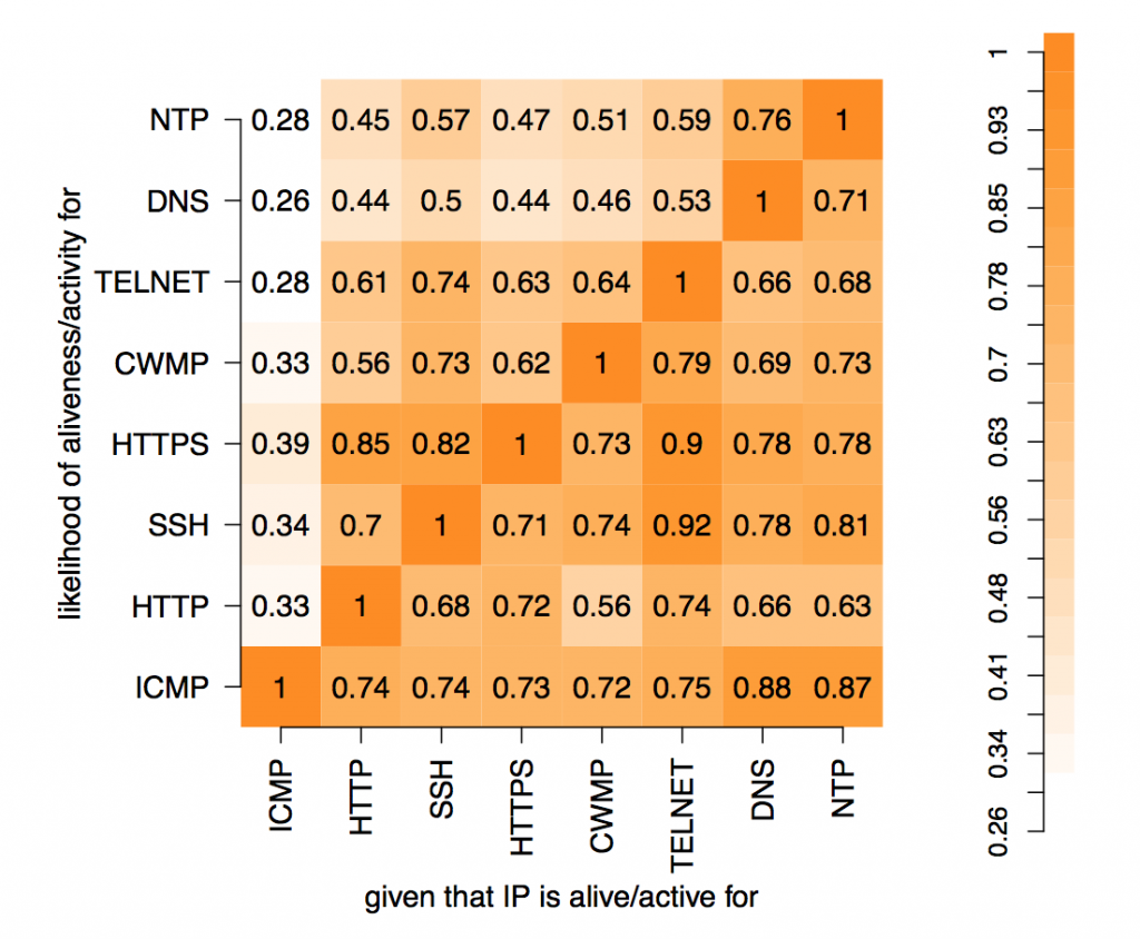
In these experiments, 8 protocols were studied: ICMP, HTTP, SSH, HTTPS, CWMP, Telnet, DNS and NTP. The results can be represented as 28=256 values placed in a 8-dimensional space with each dimension indicating whether a host did or did not respond to a probe of that protocol. Each value is the number of IP addresses that respond to that particular combination of network protocols. Abstractly, this makes perfect sense but representing an 8-d space on a 2-d screen creates problems. The paper dealt with this issue through dimensional reduction, by projecting the 8-d space on to a 2-d chart to show the likelihood of a positive response to a probe, given a positive response to probe on another single protocol. This chart is useful and easy to read but hides useful information present in the dataset.
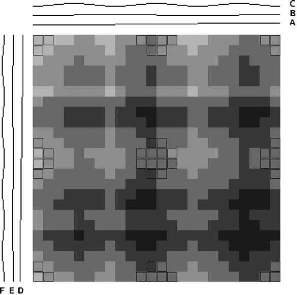
Instead of applying dimensional reduction, I looked for a way to show all the richness of the information available in the dataset. The approach I took was to apply holographic visualisation, a technique first described in a 1983 Hungarian patent, then popularised through its application to optimising catalyst library design. The technique works by allocating half of the independent variables to the x-axis and half to the y-axis, but rather than each variable increasing from left-to-right or bottom-to-top, values follow a sine-curve that increases in frequency as each variable is added to an axis. In this way, all combinations of values for the independent variables have a corresponding point in the 2-d space, on which the resulting dependent variable can be plotted. For continuous variables, this point may only be an approximation to the values, but if the variables are discrete (like our binary ones), it is possible to give each possible combination a precise position in the chart.
Some of the choices that have a significant effect on the resulting visualisation are somewhat arbitrary, and a good choice depends on the question that the user might want to ask. Rather than making these choices on behalf of the users, an interactive visualisation lets the user explore the possibilities. To enable this, I used the Clustergrammer tool, which is designed for biological data but can be repurposed. It allows rows and columns to be re-ordered, areas to be zoomed into, and has tool-tips to show extra details.
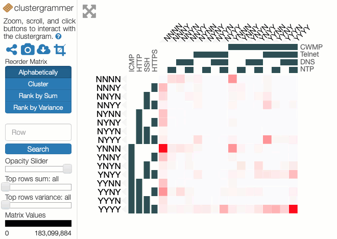
You can explore our dataset yourself on the Clustergrammer site. The axes are labelled with the protocols, and a Y indicates there was a response on that protocol and an N for no response. The colour of each square depends on the number of IP addresses responding to that particular combination of probes. The Clustergrammer documentation describes how to interact with the visualisation.
Compared to the simple 2-d projection, this visualisation takes more effort to interpret, but the data it represents is richer and can answer questions that could not otherwise be asked. There are however limitations due to the design of the Clustergrammer tool, such as it not being possible to move variables between rows and columns. I have published the source code and incorporated dataset for generating the input table to Clustergrammer and I’d encourage interested readers to explore alternative ways to visualise this data.