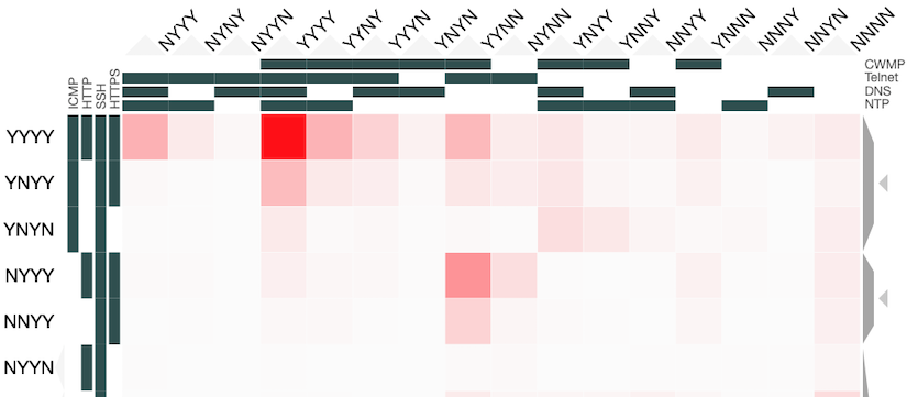
Earlier this year, Shehar Bano summarised our work on scanning the Internet and categorising IP addresses based on how “alive” they appear to be when probed through different protocols. Today it was announced that the resulting paper won the Applied Networking Research Prize, awarded by the Internet Research Task Force “to recognize the best new ideas in networking and bring them to the IETF and IRTF”. This occasion seems like a good opportunity to recall what more can be learned from the dataset we collected, but which couldn’t be included in the paper itself. Specifically, I will look at the multi-dimensional aspects to “liveness” and how this can be represented through holographic visualisation.
One of the most interesting uses of these experimental results was the study of correlations between responses to different combinations of network protocols. This application was only possible because the paper was the first to simultaneously scan multiple protocols and so give us confidence that the characteristics measured are properties of the hosts and the networks they are on, and not artefacts resulting from network disruption or changes in IP address allocation over time. These correlations are important because the combination of protocols responded to gives us richer information about the host itself when compared to the result of a scan of any one protocol. The results also let us infer what would likely be the result of a scan of one protocol, given the result of a scan of different ones.
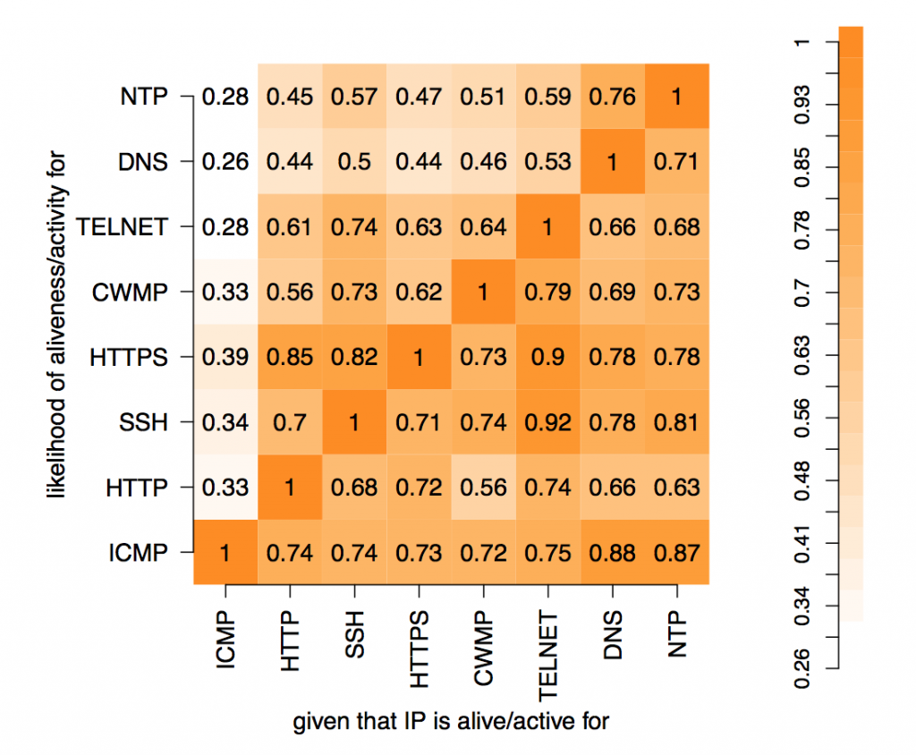
In these experiments, 8 protocols were studied: ICMP, HTTP, SSH, HTTPS, CWMP, Telnet, DNS and NTP. The results can be represented as 28=256 values placed in a 8-dimensional space with each dimension indicating whether a host did or did not respond to a probe of that protocol. Each value is the number of IP addresses that respond to that particular combination of network protocols. Abstractly, this makes perfect sense but representing an 8-d space on a 2-d screen creates problems. The paper dealt with this issue through dimensional reduction, by projecting the 8-d space on to a 2-d chart to show the likelihood of a positive response to a probe, given a positive response to probe on another single protocol. This chart is useful and easy to read but hides useful information present in the dataset.