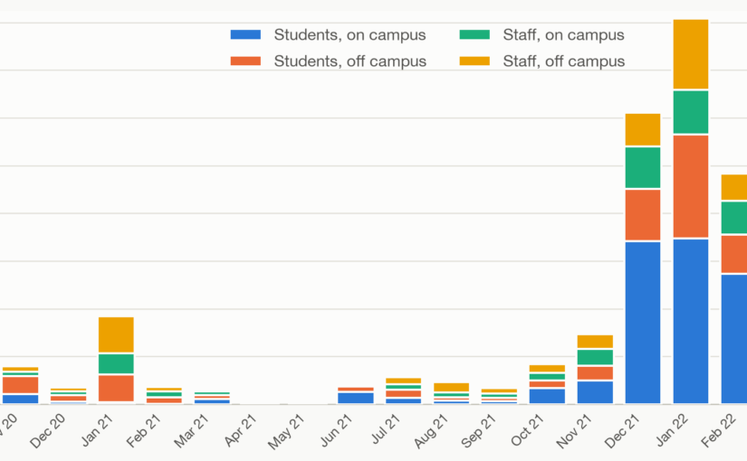
The 2020 COVID-19 pandemic required society to make substantial changes in how people lived, worked and studied, while facing uncertainty in both the behaviour of the virus and the risk it posed. To help inform their response, between October 2020 and May 2022, University College London collected a daily count of confirmed COVID-19 cases among its staff and students. This gave a snapshot of the current status, but the appropriate action depends not only on absolute infection counts but also on trends and the relationship to the national and international position.
As part of my contribution to UCL’s pandemic response, I collected these daily statistics, resolved data quality issues, and created interactive visualisations to identify and illustrate trends in COVID cases among UCL staff and students. These were used within the Computer Science department, throughout UCL, and beyond, to inform measures that allowed UCL to continue to fulfil its education and research mission while protecting its members and society as a whole.
Along with this blog post, I’m releasing a historical archive of these statistics and, to put the dataset in proper context, a record of the pandemic-response newsletter published by UCL. Both are preserved as a Zenodo artefact.
Why a campus-scale signal was worth having
National statistics answered a national question. They could not tell a department whether it was sensible to hold a seminar in person next week, run a laboratory, or bring a team back on site, because they described the country, at a lag, rather than the building you actually worked in. Planning needed a signal at the scale of the decision. That mismatch, between figures gathered to answer a national question and choices that had to be made building by building, is why a local signal had to be built at all rather than drawn from what already existed. UCL’s case statistics supplied one, separated into staff and students and, crucially, into those who had recently been on campus and those who had not. The primary statistics I published were a seven-day rolling total, which smoothed out noise and day-of-week effects presenting in the daily count. These charts behaved as an early-warning line, moving before a rise was widely apparent, and for the specific community whose risk was being weighed.
What the trends actually showed
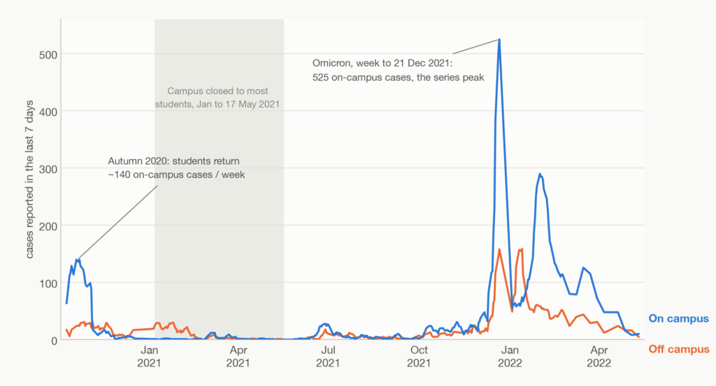
Three features of the series show what made it worth watching. The first is early warning. The data was first published with the autumn 2020 start-of-term surge, where student on-campus cases climbed to roughly 140 a week through October: the wave predicted from the mass return of students, becoming visible in the local figures before it was a national headline.
The second is the on-campus split, showing how much of a national wave actually arrived in UCL. National data recorded two large waves but could say nothing on the local scale. The on-campus split resolved that directly: in 2021 the campus was closed and the wave passed off-site; in 2022 it was open, and the wave was closer to home.
The third feature is timeliness. The on-campus line reached its highest point of the whole record, 525 student cases in the week to 21 December 2021, a plain signal to move activity off campus before term ended, which is exactly the call UCL’s newsletter had made on 13 December, as that wave built:
Just as numbers of COVID-19 cases are rising throughout the UK, including the new Omicron variant, so too are they on campus. Whilst campus remains open […] you may move your teaching online for the remainder of this week.
The data let a planner see that local trend rather than infer it from the country’s.
The emails say why
To put the case statistics in context, the dataset is accompanied by newsletters published by UCL over the pandemic period. They begin on 9 March 2020, seven months before the case page existed, and run to 4 May 2022, setting out the choices behind every turn in the graphs: when to send people home, when to test, when to bring them back. The first newsletter, on 9 March 2020, expressed the initial optimism:
At this stage, we do not believe there is reason for our community to worry unduly about the virus.
The last, on 4 May 2022, relays the government’s removal of all remaining restrictions and its advice on “living safely with respiratory infections including COVID-19”. Between those two sentences lie two years of closures, travel windows, testing regimes and staggered returns, each announced in its turn, and each leaving a mark on the graphs: the decision to keep teaching online, and the on-campus line lying flat against a national wave; and the 525-case Omicron peak. The numbers show the course the pandemic took; the emails show why it took it.
Why preserve the archive?
With the emails beside them, the numbers tell a later reader how the pandemic took its course through one institution: not only that cases rose and fell, but which decisions moved them, when, and to what effect. A historian, or the next department caught in the next emergency, can read the outcome and the reasoning together.
So what is a record like this actually good for, and what should not be asked of it? Its limits are real. These are reported cases only, an undercount of unknown size; voluntary reporting understates most exactly where testing was scarce or a return to campus was discouraged, so the figures are in part a record of what people were willing and able to report, not of the virus alone. “On campus” marks recent presence, not the site of infection.
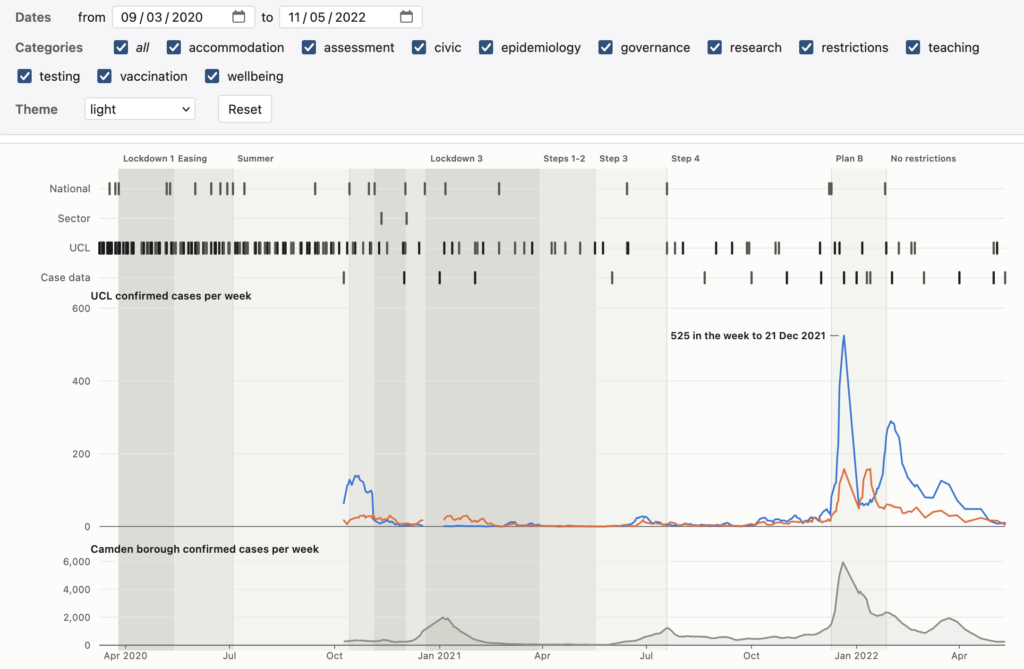
The daily series, the 6,140 hourly page captures behind it, and all 168 newsletters are in the archive, and the whole of it regenerates from its sources byte-for-byte, so any figure here can be checked rather than taken on trust. The code and extracted data are in GitHub and deposited on Zenodo under a citable DOI (10.5281/zenodo.21626802); the reproduced UCL pages and newsletters are included under their original terms. As an example of what is possible, I put together an interactive visualisation showing UCL’s statistics in the context of national policies and the local environment, annotated with key events at UCL and beyond.
Each day’s figure was once a snapshot of an uncertain present. Gathered, preserved, and set beside the emails that explain them, they have become a snapshot of a different kind: not of a single day, but of how one institution reasoned its way through two years whose end it could not see. What a later reader makes of it is now the open question.